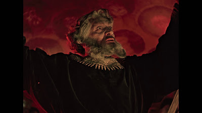
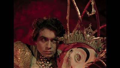
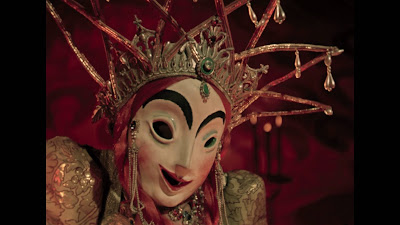
The screens accompanying are from the third last reel, shot and processed in Agfacolor with the all-male ballet/orgy during which Ivan plans the dispatch of his halfwit cousin, Vladimir to eternity, removing the last barrier to his total domination of the Russian Empire. As we know Stalin was so unnerved by the clear parallels with Ivan's insane cruelty and his own, Part 2 of the film remained banned from distribution after its completion in 1946 until the first cultural thaw under Krushchev in 1958. I still think it's Eisenstein's masterpiece.
The new disc is on the French Bach label, French subtiltes only. I see no future plans for it anywhere in the Anglosphere, alas. Part 1 from 1944 and Part 2 (1946) are both contained on a single BD50 disc and have a reasonable bitrate. If anything, in an ideal world they could double the bitrate and return some of the inherent grain to the image with a more highly resolved encode. But this rendition is very fine, nonetheless.
The film’s restoration itself is meticulous, no more frame jumping (from unprocessed timing notches) which literally plagued every 35mm and video of the movie I've ever seen, until now. No more density fluctuations with leeched black levels or white blowouts, no more tramlines and other emulsion damage, and no more shit quality audio.
Finally, we can hear the last milli-seconds of atmos in the winter soundstages where Prokofiev’s score was recorded. All the while in “real life” and history the insanely murderous battle to hold Leningrad from Nazi invasion roared on, with millions dying, in the dying days of WW11.
And a final minor correction to many people's misconceptions about the color sequences, Although they look superficially like the old two-color pre-1933 Technicolor process, which was essentially red and green printing, Agfacolor was a full color dye subtraction process like Eastman, but in many ways superior for archival quality.
These two sequences in Part 2 were designed by Eisenstein to appear in a controlled aesthetic of flesh tones, red, black, gold and a green range from emerald to turquoise. Blue is absent. This new restoration glows with the unreality of it.
There are so many moments when you think you're watching the world of Sternberg and Dietrich and The Scarlet Empress in particular being reborn in another similar Russian narrative trope, in the way backdrops, furniture, masks and wardrobe take on a life of their own within the frame, as though they are commenting in counterpoint to the human staging.


No comments:
Post a Comment
Note: only a member of this blog may post a comment.